Photo by: Dahlia Katz
Artist’s Note
I am a Toronto based artist and designer, specializing in traditional papercraft techniques and photo collage.
My work focuses on distilling and containing memories, to create a memento that requires active participation, and engages the viewer through the element of time.
These layered kirie (hand cut paper) graphics play with shadows, light, and optical ‘tricks’. The viewer is encouraged to explore the dynamic interplay between layers, and as they become engaged experience a sense of entering the work, and existing within it, to bring the image to life.
Toronto Subway Poems: Constrictive Poetry and Collage
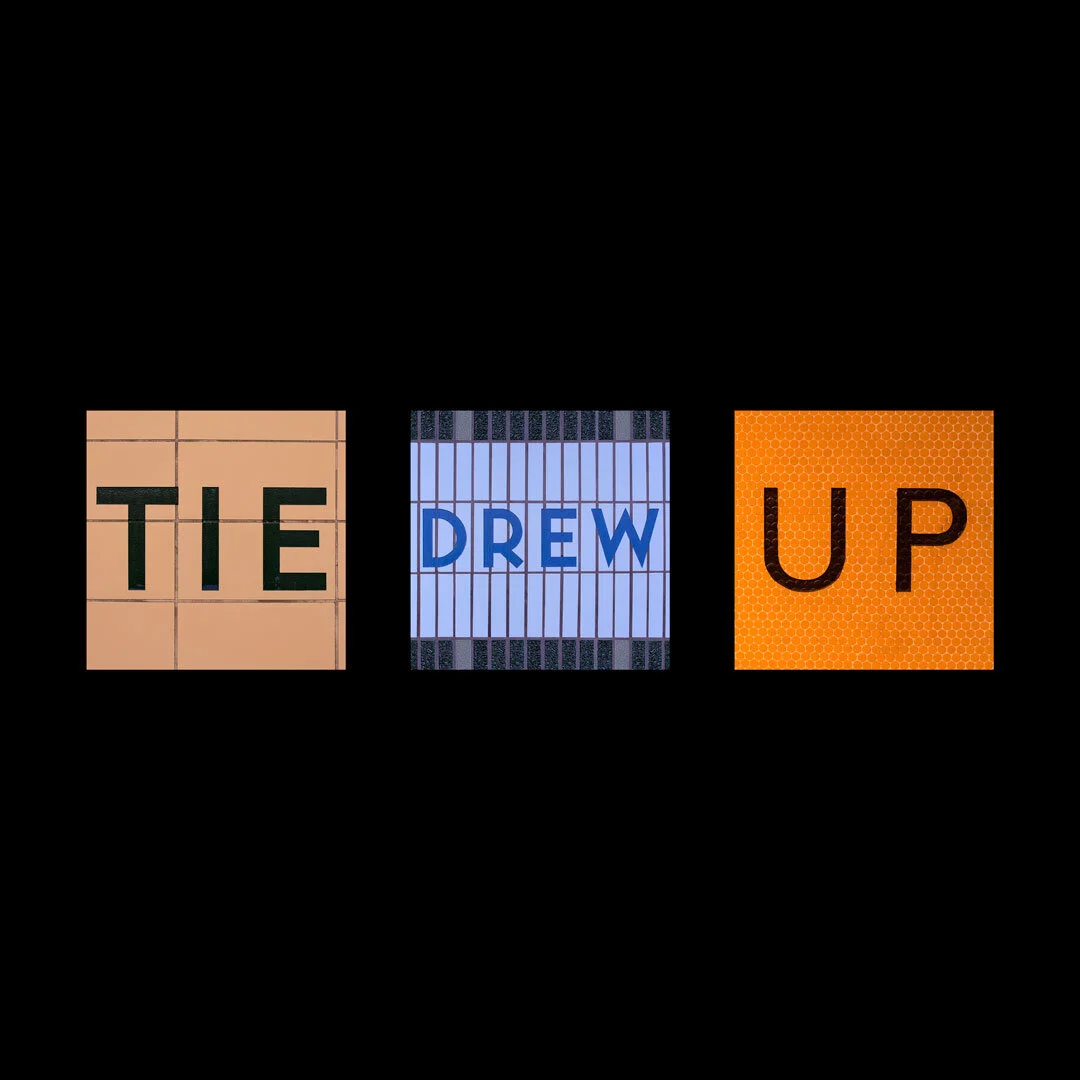
“Tie Drew Up” photo collage
Inspired by a reading of constrictive poetry, I decided to play a word game with the Toronto Subway station names. The goal was to find as many words (and later initials) from the station names without re-arranging the letters, and then photograph and crop them. The words I came up with were a rather awkward collection, lol, and I had a lot of fun putting them together into poems and visual word play.
The subway tiles evoke so many memories over the years, and are especially personal during this time, when we can’t be together.
Kirie: the traditional Japanese art of papercutting
The art of cutting paper has been around for centuries, and has developed differently around the globe, in ways that are unique to each culture involved. It is believed to have originated in China in the 4th century, during the Han Dynasty, and developed into the traditional Chinese art of Jianzhi during the 6th century.
My work is heavily influenced by Japanese design, and traditional paper arts and crafts such as origami, kirigami, origamic architecture, and kirie.
The art of Kirie, when translated, simply means: cut picture.
Traditionally, the art of paper cutting is often done with only one sheet of paper. In my recent work I have been layering the cut paper to create a dynamic play with shadows, different viewpoints, hidden colours, and optical ‘tricks’ that appear to create motion when engaging with the work.
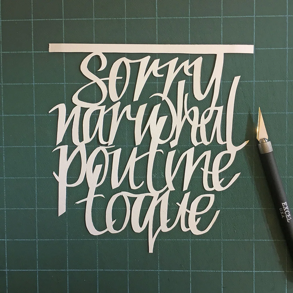
In the example below: “Sorry Narwhal Poutine Toque”, the piece looks completely white when standing directly in front. As the viewer moves to the side, a layer of hidden colour is revealed underneath, and at a distance, this colour shapes the silhouette of a maple leaf.
“Sorry Narwhal Poutine Toque” layered kirie; 12” by 12” framed. 2017
Similarly, in this piece: “Indigo Proud”, the word Indigo is difficult to notice immediately while standing directly in front of the work. Once the viewer moves to the side, they can see the entire spectrum within the letters.
“Indigo Proud” layered kirie, 10” by 10”, framed. 2017


